Hey everyone, This is an EDA project analyzing super store data set and visualizing it. The objective of this project is to analyze and identify trends and patterns in the current retail sales and identify which sector of the market is under loss and which sector is making huge profits. Every sector offers discounts on sales, but, do they collect profits as needed on the discounts they offer? Which shipment class boosts the sales of which category?
This tutorial will guide you through the process of retrieving answers to all these questions.
Let us get started!
Loading Packages
rm(list=ls())
library(ggplot2)
library(tidyverse)
Reading dataset
df <- read.csv("SampleSuperstore.csv")

str(df)
## 'data.frame': 9994 obs. of 13 variables:
## $ Ship.Mode : Factor w/ 4 levels "First Class",..: 3 3 3 4 4 4 4 4 4 4 ...
## $ Segment : Factor w/ 3 levels "Consumer","Corporate",..: 1 1 2 1 1 1 1 1 1 1 ...
## $ Country : Factor w/ 1 level "United States": 1 1 1 1 1 1 1 1 1 1 ...
## $ City : Factor w/ 531 levels "Aberdeen","Abilene",..: 195 195 267 154 154 267 267 267 267 267 ...
## $ State : Factor w/ 49 levels "Alabama","Arizona",..: 16 16 4 9 9 4 4 4 4 4 ...
## $ Postal.Code : int 42420 42420 90036 33311 33311 90032 90032 90032 90032 90032 ...
## $ Region : Factor w/ 4 levels "Central","East",..: 3 3 4 3 3 4 4 4 4 4 ...
## $ Category : Factor w/ 3 levels "Furniture","Office Supplies",..: 1 1 2 1 2 1 2 3 2 2 ...
## $ Sub.Category: Factor w/ 17 levels "Accessories",..: 5 6 11 17 15 10 3 14 4 2 ...
## $ Sales : num 262 731.9 14.6 957.6 22.4 ...
## $ Quantity : int 2 3 2 5 2 7 4 6 3 5 ...
## $ Discount : num 0 0 0 0.45 0.2 0 0 0.2 0.2 0 ...
## $ Profit : num 41.91 219.58 6.87 -383.03 2.52 ...summary(df)## Ship.Mode Segment Country
## First Class :1538 Consumer :5191 United States:9994
## Same Day : 543 Corporate :3020
## Second Class :1945 Home Office:1783
## Standard Class:5968
##
##
##
## City State Postal.Code Region
## New York City: 915 California :2001 Min. : 1040 Central:2323
## Los Angeles : 747 New York :1128 1st Qu.:23223 East :2848
## Philadelphia : 537 Texas : 985 Median :56431 South :1620
## San Francisco: 510 Pennsylvania: 587 Mean :55190 West :3203
## Seattle : 428 Washington : 506 3rd Qu.:90008
## Houston : 377 Illinois : 492 Max. :99301
## (Other) :6480 (Other) :4295
## Category Sub.Category Sales Quantity
## Furniture :2121 Binders :1523 Min. : 0.444 Min. : 1.00
## Office Supplies:6026 Paper :1370 1st Qu.: 17.280 1st Qu.: 2.00
## Technology :1847 Furnishings: 957 Median : 54.490 Median : 3.00
## Phones : 889 Mean : 229.858 Mean : 3.79
## Storage : 846 3rd Qu.: 209.940 3rd Qu.: 5.00
## Art : 796 Max. :22638.480 Max. :14.00
## (Other) :3613
## Discount Profit
## Min. :0.0000 Min. :-6599.978
## 1st Qu.:0.0000 1st Qu.: 1.729
## Median :0.2000 Median : 8.666
## Mean :0.1562 Mean : 28.657
## 3rd Qu.:0.2000 3rd Qu.: 29.364
## Max. :0.8000 Max. : 8399.976
## Data preparation and Cleaning
Checking for abnormalities:
#any null values?
is.null(df)
## [1] FALSE#any duplicacy?
dfnew <- df %>% distinct() ##yes, duplicates were removedWe see that there is an outlier in the Sales feature, an unusual hike. Let’s replace it with the mean of sales.
maxSales <- max(dfnew$Sales)
dfnew$Sales <- replace(dfnew$Sales, dfnew$Sales==maxSales,mean(dfnew$Sales))
Removing country and Postal Codes feature
dfnew <- dfnew %>% select(-c(Country, Postal.Code))Visualization
Let’s analyze patterns in our cleaned data
Sales vs Quantity
In the below graph, we see the following pattern that most of the sales have been triggered by the standard class of shipment mode.
ggplot(data = dfnew, aes(x = Quantity, y = Sales, fill = Ship.Mode) )+ geom_bar(stat = "identity") 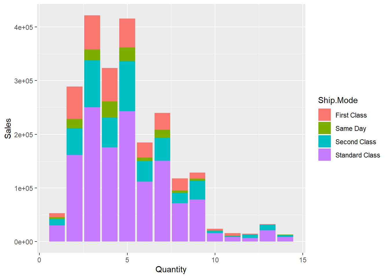
Sales vs Profit
And hence, obviously we see more profits/loss have been availed from the standard shipment class. But, there are not higher range profits seen this feature.
ggplot(data = dfnew, aes(x = Sales, y = Profit, color = Ship.Mode)) + geom_point()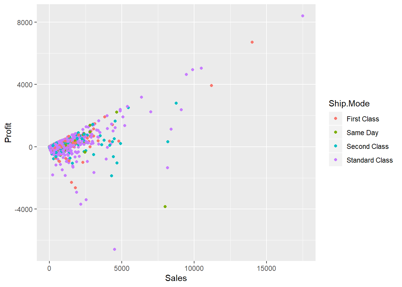
Sales vs Discount
Let us see how Sales are affected if discounts are offered.
ggplot() + geom_point(data = dfnew, aes(x = Discount, y = Sales, color = Ship.Mode)) 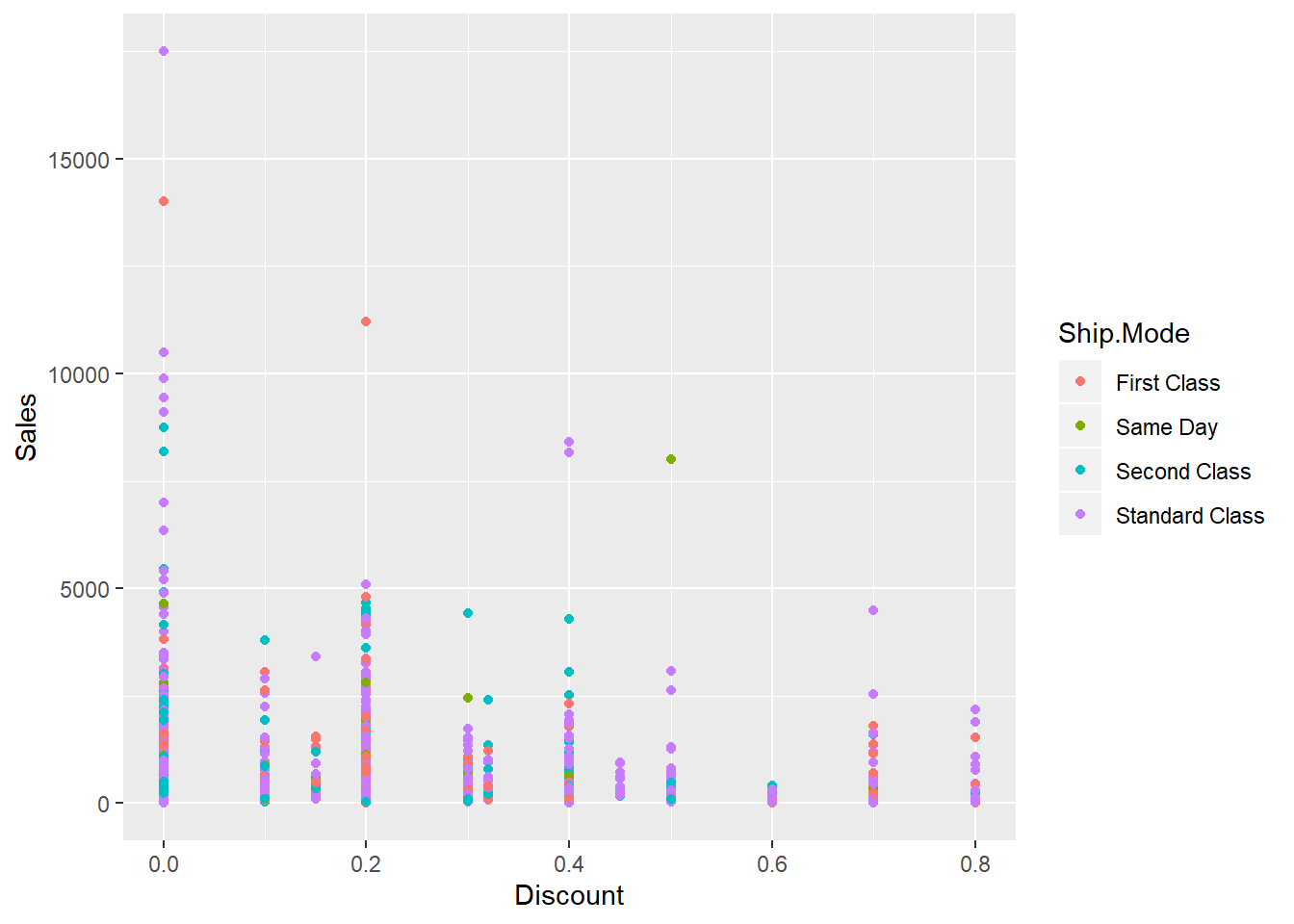 It is evident from the above graph that discounts attract more sales. But, discounts attract mostly the Standard Class shipment. Same day shipment mode receive the least disount offers.
Profits vs Discount
Let’s see whether profits have been triggered if discounts have been redeemed.
ggplot() + geom_bar(data = dfnew, aes(x = Discount, y = Profit, fill = Ship.Mode), stat = "identity") 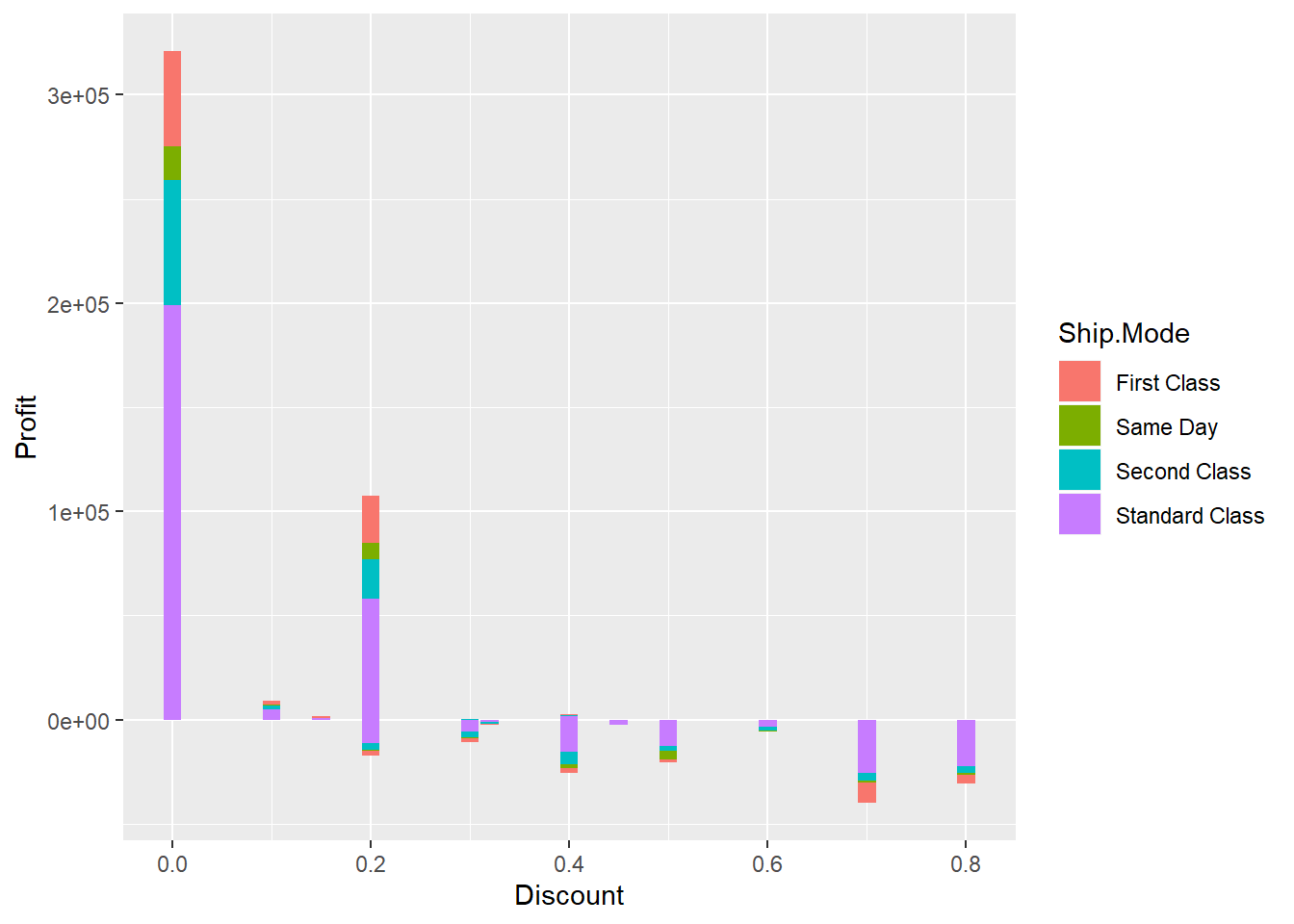
Yes, we see clearly, the more discounts have been offered and redeemed, the lesser profits the segments have achieved. Products with no discounts show high range of profits but as the discount range increases, we only see more and more loss with hardly any profit.
Let us see if this is the case with other segments
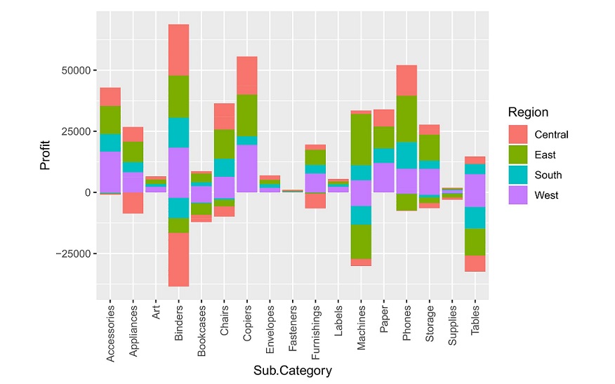
ggplot() + geom_bar(data = dfnew, aes(x = Sub.Category, y = Profit, fill = Region), stat = "identity") + theme(axis.text.x = element_text(angle = 90, vjust = 0.5, hjust=1))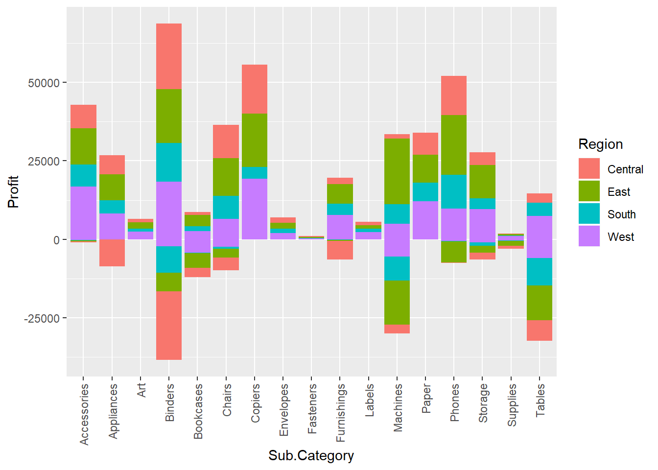 We see that more losses have been incurred by the Binders industry mainly in the Central region and Machines and * Tables * industry.
Now,
ggplot() + geom_bar(data = dfnew, aes(x = Category, y = Sales, fill = Region), stat = "identity") + theme(axis.text.x = element_text(angle = 90, vjust = 0.5, hjust=1))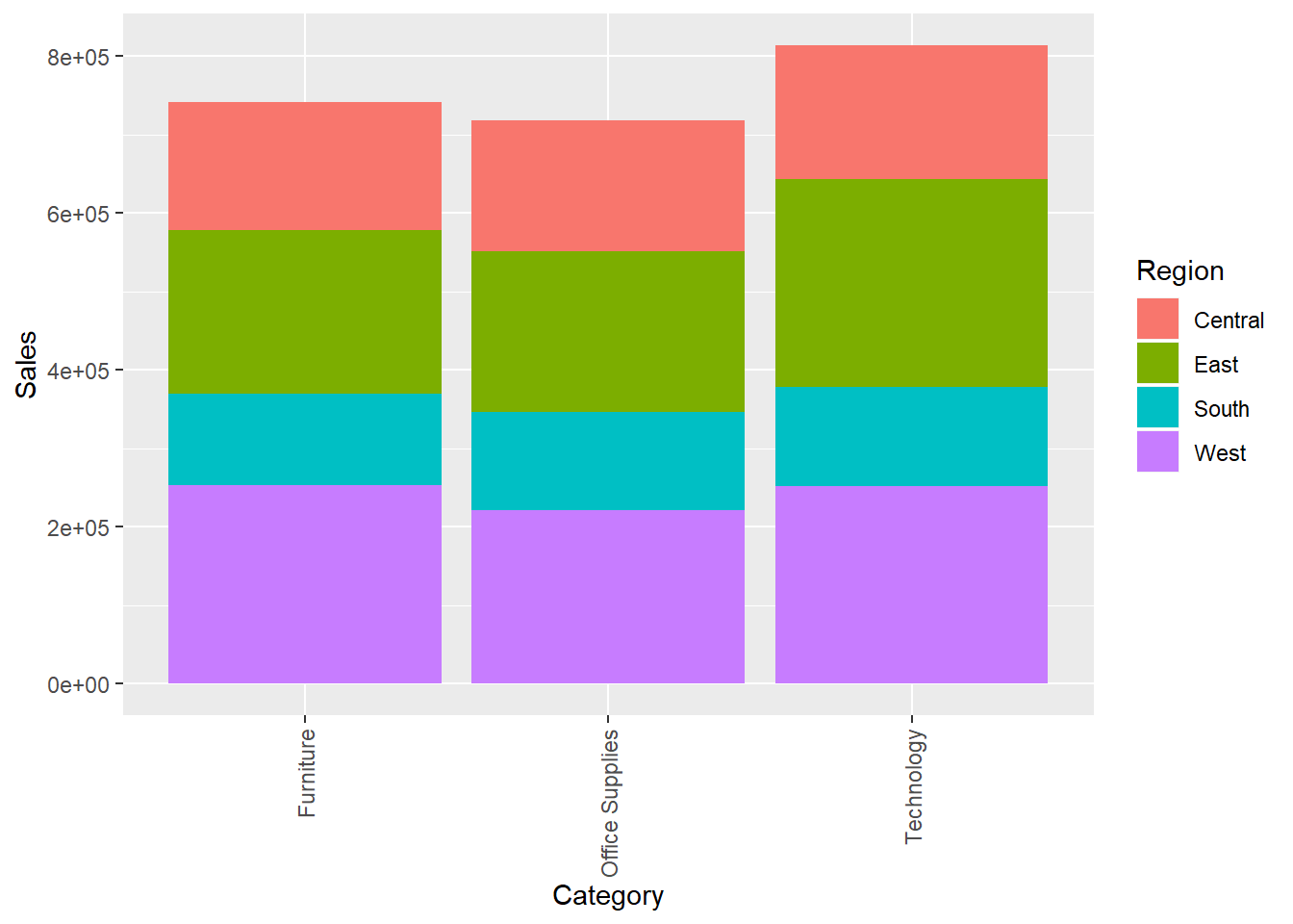 More Sales have been incurred by the technology category, then Furniture and office supplies. Mostly sales have been made from the West and East regions
ggplot() + geom_bar(data = dfnew, aes(x = Category, y = Profit, fill = Region), stat = "identity") + theme(axis.text.x = element_text(angle = 90, vjust = 0.5, hjust=1))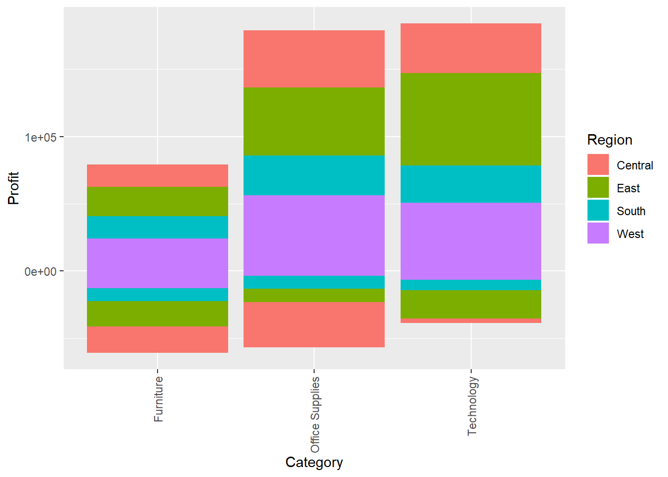
The furniture category incurrs more losses than losses in the technology and Office Supplies category.
Since, Sales also vary from low to high in this category so is are profits.
ggplot() + geom_point(data = dfnew, aes(x = Sales, y = Profit, color = Category)) 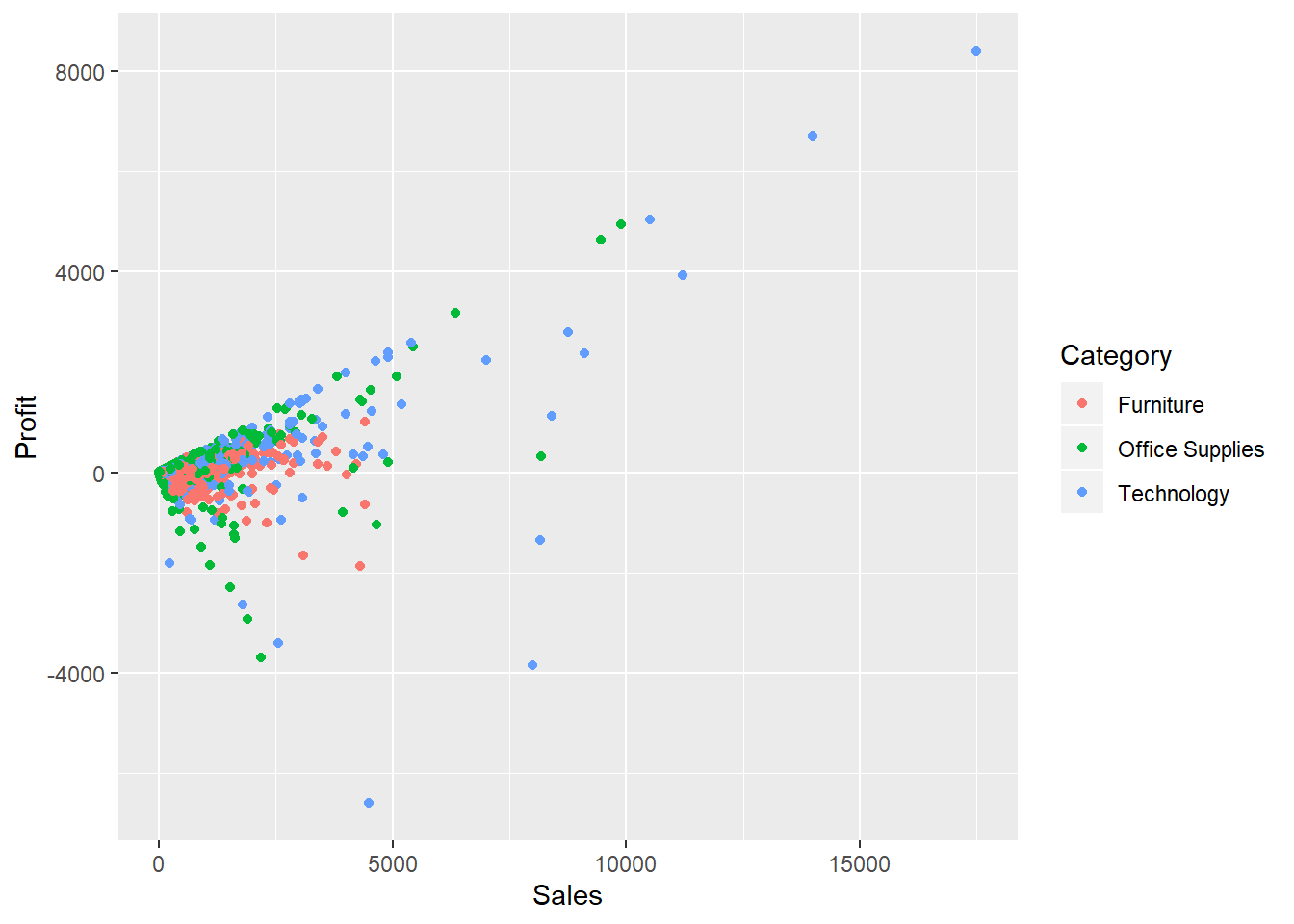
We have now witnessed from the above graphs that the Sales to Profit ratio is same in every category, no matter how they are clubbed.
Conclusion
Recommended Solutions/ Key Insights
Same day shipment if receives more discounts can trigger sales/profits. Discounts should be based on the Sales and should not increase a particular range otherwise unnecessary disounts with low sales can witness huge losses Binders and Machines industry should be focused upon more so as to strengthen these weakened industry areas. Office Supplies and the Furniture industries do not seem to boom in the Central Region.
Outro
So, this is it. We chose a simple, small dataset to start with and learnt how to manipulate data using a few simple functions.
Stay tuned for more tutorials!
Thank You!